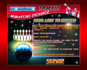
First, we sure hope you use splash pages in traffic exchanges – we don’t think you should ONLY use splash pages, but certainly give them a chance. These are effective ways to quickly capture your visitors’ attention. You only have a handful of seconds to get your main points across so they will take some kind of action.
Before you go out and create a splash page there are many important elements to consider, such as the following:
- Colors – complementing vs clashing
- Graphical elements
- Legible text/messaging
- Length of message
- Call-to-action
…to name some of those that are most important.
Just because you have a splash page doesn’t mean you should expect good results. In fact, we’ve seen some pretty awful splash page designs and while we commend those who’ve put the effort in to create them, the effectiveness is likely not much more than using a typical web page.

Sample splash page
When you create a splash page it is a great idea to test different messaging, colors, and even font – yes, font can make a difference. If your visitors can’t easily read what the page says, what’s the point? Additionally, if your graphics are cheesy…it would be a good idea to either cut them out entirely or use graphics which don’t hurt your conversions.
Advice: ask some people in the industry, who are experienced, what they honestly think of your splash page before you begin using it, possibly wasting lots of credits. Wouldn’t you prefer someone be honest that your design needs some work than to waste tons of credits which took you hours to earn? Feedback can help save you frustration with your marketing.
Small changes you make could mean a big difference. Don’t be afraid to split-test your splash pages, and track your efforts.
PS: If you haven’t yet, like us on Facebook for a special Reward Code
